Renacer Foundation
Renacer Foundation is a non-profit organization that provides food, clothing and shelter to kids in Nicaragua. For over 40 years it has been a family-run organization and in 2012 they approached me to to help build them a brand identity and website that would help them grow as their vision for Nicaraguan outreach expands.
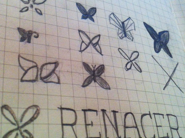
Logo
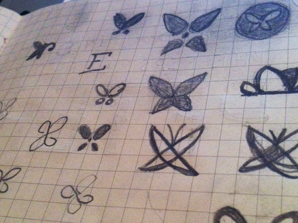
The name “renacer” mean’s “reborn.” Their logo is a butterfly, whose hand-drawn shape creates and infinite path.
Renacer came to me with the goal of creating a logo that communicated two things: hope and children. Considering the meaning of their name, a butterfly seemed like the perfect symbol to capture these ideas. The symbol and wordmark are completely hand-drawn, creating an authentic and youthful presence.
Color Palette
Website
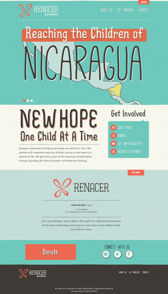
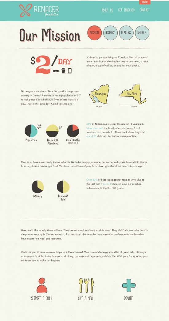
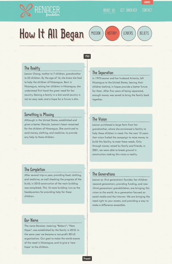
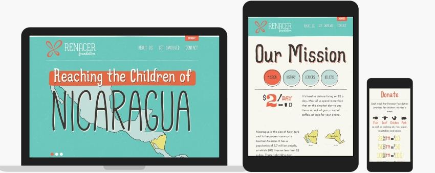
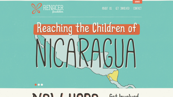
I made a responsive website for Renacer that utilized hand-drawn icons and other elements that give the site an organic, hand made feel. Its also retina-optimized so it looks crisp and beautiful on all the shiny new retina devices.
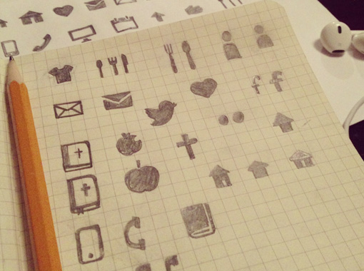
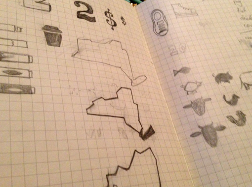
Icons
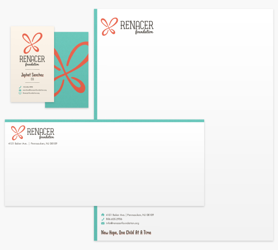
Collateral